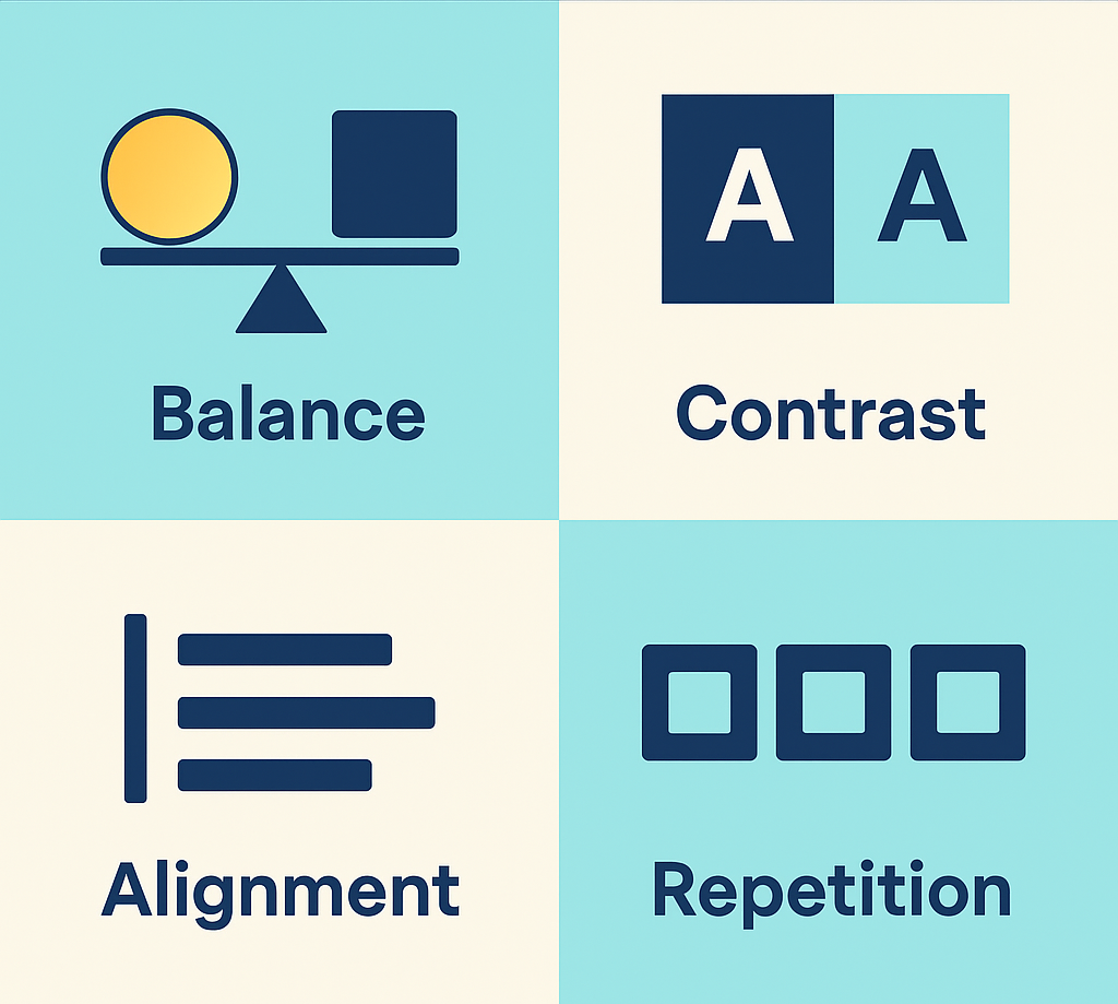
When you open a website, what makes you stay or leave quickly? The answer lies in effective web design, which shapes your experience and lets you find what you want easily. Web design isn’t just about making a site look nice—it’s about balancing form and function to serve users like you. There are four core principles every good web design follows to ensure the site is both beautiful and user-friendly. Let’s explore these four principles clearly, so you know what makes a website really work well.
1. Balance: Creating Visual Stability
Balance in web design is like balancing on a tightrope—it means giving equal weight to different parts of a page so it doesn’t feel lopsided. When a webpage is balanced, your eyes can move smoothly across it, naturally noticing everything important without feeling overwhelmed or confused.
There are two types of balance:
- Symmetrical Balance: Both sides of the page mirror each other. It creates a calm, formal feeling and makes the content easy to follow.
- Asymmetrical Balance: Different elements have different sizes or colors but still feel balanced overall. This style is more dynamic and exciting but needs careful arrangement.
When you visit a site with good balance, you find what you’re looking for faster because the design guides your eyes in a logical flow. Have you ever seen a messy page with buttons and text scattered everywhere? You probably left that site fast—that’s what poor balance feels like.
2. Contrast: Making Elements Stand Out
Contrast means differences — in colors, fonts, sizes, or shapes — that help separate important pieces from less critical ones. You want contrast so your eyes can tell what’s clickable, what’s a headline, and what’s just background.
Think about a website with light grey text on a white background. It’s hard to read, right? That’s a lack of contrast. When designers use strong contrast, like black text on white or a bright button against a dark background, you can instantly spot what matters.
Contrast isn’t only about colors. Sometimes it’s about:
- Using bold fonts for headings.
- Changing font sizes to show importance.
- Making buttons bigger or different colors for calls-to-action.
Good contrast helps you scan the page quickly and not miss important information.
3. Alignment: Keeping Things Neat and Organized
Imagine walking into a room where everything is scattered randomly. You’d feel lost looking for a chair or the light switch. That’s the chaos of a webpage without alignment.
Alignment means lining up text, images, and buttons so everything feels connected and ordered. When elements line up on the same axis or grid, your brain understands the layout better, making the website easier and quicker to use.
There are common types of alignment:
- Left-aligned: Most websites align text and items to the left. It feels natural since reading starts from the left in many languages.
- Center-aligned: Used for fewer, important items like titles or special messages.
- Right-aligned: Less common, but it can create interesting layouts when used carefully.
Whatever technique is used, the key is consistency in alignment so your eyes won’t jump around too much.
4. Repetition: Building Familiarity and Brand Recognition
Repetition means using the same colors, fonts, shapes, or style across the site. This principle helps your brain recognize patterns and know where to focus. When elements repeat, the webpage feels polished, and you feel confident navigating it.
For example, a site might use the same blue color for all buttons or the same font style for every headline. That repetition creates a rhythm so you’re not guessing, “Is this button different from that one?” It also strengthens brand identity by making the site look consistent everywhere.
Repetition makes the user experience smoother and more enjoyable. When you visit many pages of the same website, you don’t have to relearn how the site works every time because the design stays the same.
How the Four Principles Work Together
When you combine balance, contrast, alignment, and repetition, you get a website that feels welcoming and easy to explore. These principles aren’t stand-alone; they support each other to guide your eyes naturally and help you find exactly what you need without frustration.
- Balance ensures the page feels steady and not chaotic.
- Contrast makes sure important elements stand out.
- Alignment keeps everything tidy and easy to read.
- Repetition creates a sense of unity and familiarity.
Together, they make you want to stay longer and explore more on the website.
Why Should You Care About These Principles?
Knowing these four principles helps you become a smarter web user and creator. If you build a website or blog, you can use these ideas to make your site look professional and work well for visitors. Even if you just browse the web, recognizing these principles helps you find the best sites faster.
A website that follows these principles respects your time and attention. It doesn’t confuse or frustrate you. Instead, it invites you in and keeps you engaged. That’s the power of good web design.
Foundation of Creating Websites
The four principles of web design—balance, contrast, alignment, and repetition—are the foundation of creating websites that are easy to use and visually pleasing. Next time you visit a website, see if you can spot these principles at work. When they’re applied well, you’ll barely notice because they make your experience smooth and enjoyable.
Keep these principles in mind whether you’re creating your own site or just want to understand what makes websites great. They are simple to grasp but powerful in impact. Remember, great web design is all about making your life easier.